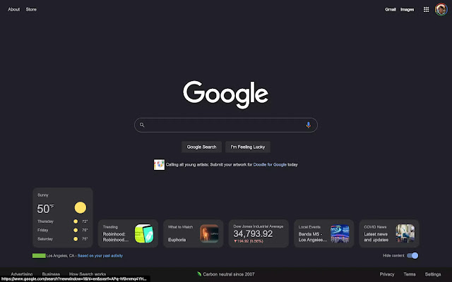
This Google homepage will always be noted for having a simple UI with a search area at the top. Google Search is now testing a set of widgets on the desktop browser for a Discover-like experience.
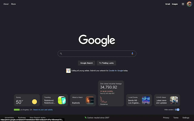
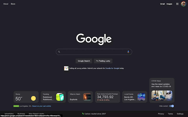
This cards may be seen at the bottom of Google.com. In the bottom-right corner, there’s a “Hide content” button, and Google notes your zip code/city and says the information is “based on your prior behaviour.” Six cards are available when the window is completely extended, and they all expand on hover.
Google Search widgets on desktop web
🔎Weather
🔎Trending
🔎What to Watch
🔎Stocks
🔎Local Events
🔎COVID News
Tapping brings up the full site result, along with the Knowledge Panel card and/or Google Search experience. The number of cards displayed is determined by the size of your screen, and there is no way to navigate between them without physically enlarging the window.
Today, we’re only seeing this on two Google Accounts, across several signed-in devices. As a result, this is most likely a test to see if a complete rollout is necessary.
This gives users a Google Discover-like experience without requiring them to wade through yet another feed. Back in 2018, the business was certain that Discover would not be going to the desktop browser – just mobile.
What Google Search is trying today is similar to widgets in that it adds functionality to a popular online destination without interfering with the clean user experience. Of course, the weather is the most helpful feature, and this is a preferable alternative to the increasingly crowded Chrome New Tab page. It also has a resemblance to the iGoogle dashboard.
To get real-time news alerts join the Technewsrooms Telegram group. You can also follow us on Twitter and subscribe to our Google News feed for updates.


