Google Wear OS 3 has been redesigned, leaked images
We’ve mostly seen Wear OS 3 in the context of Samsung’s One UI on the Galaxy Watch 4 as of today. New Wear OS 3 screenshots give us another look at what may be termed the basic Google experience.

Google has confirmed that I/O will take place on May 11-12
Android12L: A fresh design for larger screens
Google patents Pixel Buds and Pixel Watches skin interface technologies
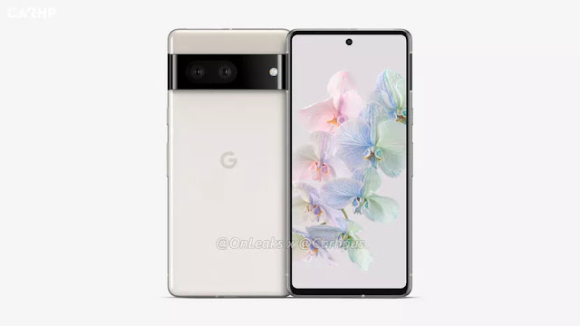
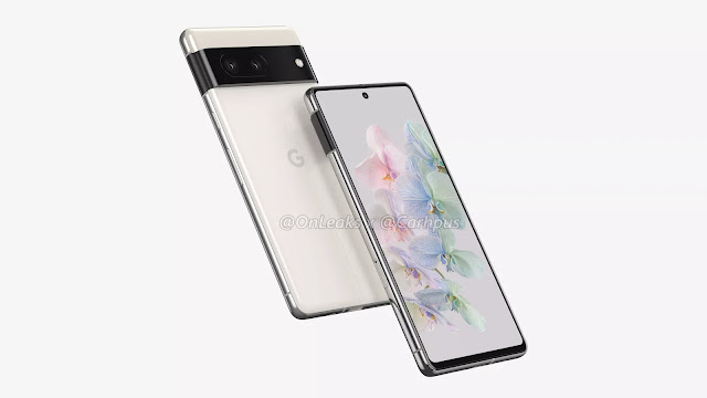
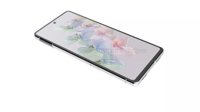
Google’s Pixel 7 leaks out in vanilla cloudy white renders
While Samsung has already released an improved Galaxy S-series family early in the year, firms like Google are almost certain to keep their supporters waiting for several more months.
It shouldn’t come as a surprise that the premium Pixel 7 and 7 Pro are both getting the same treatment ahead of its projected combined commercial release in October 2022, given that the mid-range Pixel 6a leaked in high-res factory CAD-based renderings all the way back in November 2021.
Given that October is still over seven months away and Google appears to have enough on its plate with all those pesky Pixels 6 issues that refuse to go away, the crude and sketchy Pixel 7 renderings released yesterday would have been tolerable for a little longer, making the wait a bit more bearable.
Serial leaker Steve Hemmerstoffer, however, was clearly not satisfied with only blowing the Pixel 7 Pro’s cover in excellent detail and crystal clear clarity, as he did the same today (in partnership with Carhp) for the incoming flagship’s smaller brother.
At first glance, this looks almost identical to the 7 Pro, with a perfectly flat display with fairly generous bezels (by 2022 high-end standards), a centred hole punch, and, perhaps most notably, a protruding back camera module that wraps around the handset’s chassis, presumably making it fit in a little better with its overall look.
[Exclusive] CAD renders of the Google Pixel 7 Pro has leaked
The Google Pixel 7 Series is expected to be the year’s most popular Android smartphone range, competing against Apple’s iPhone 14 series and Samsung’s Galaxy S22 series. Every year, Google’s Pixel smartphones are released in October, but today, Smartprix is presenting the Google Pixel 7 Pro for the first time. Steve Hemmerstoffer aka OnLeaks has rendered the Google Pixel 7 Pro in crisp 5K quality. Take a look at them below.
These exclusive Pixel 7 Pro photographs show how the design has progressed since the Google Pixel 6 Pro, which is now on the market. The Google Pixel 7 Pro will include a 6.7 to 6.8-inch curved display with a single punch-hole selfie camera on the front. It will have an OLED display with a high refresh rate that will compete with Samsung’s current flagship, the Galaxy S22 Ultra.
On the other hand, Google has made some improvements. While Google’s characteristic dual-tone design has been kept, the visor-like back camera module has been fused with the new frame, as shown in the image. It appears to be blended with the frame, similar to what Samsung accomplished with the Galaxy S21 series lately.
Dual stereo speakers and a USB Type-C charging connector are located on the device’s bottom, while a SIM card tray is located on the left side. The gadget includes a power button and volume rockers on the left side, and antenna bands can be seen on all four sides.
A horizontal camera strip holds three cameras: a main wide-angle camera, a periscope telephoto camera, and most likely an ultra-wide camera. A microphone unit, as well as a pair of sensors, are located in the camera module. The camera module protrudes slightly.
The Pixel Pro sports curved edges and a design comparable to the Samsung Galaxy S22 Ultra, albeit it will be somewhat thinner than the S22 Ultra, which is 8.9mm thick against 8.7mm for the Pixel Pro. It’s possible that this is due to the battery’s different sizes. The device’s thickness is 11.2mm when the camera bump is included. The device’s dimensions are roughly 16376.68.7mm.
Google is trying with Discover widgets New Look cards On desktop
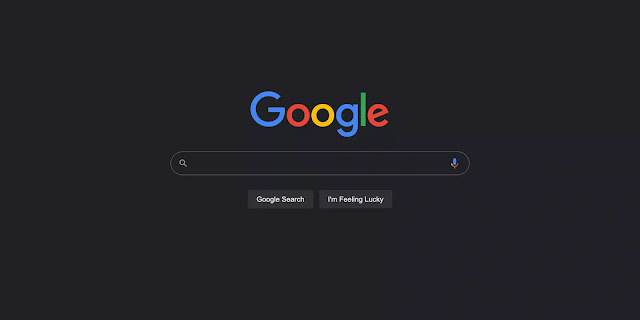
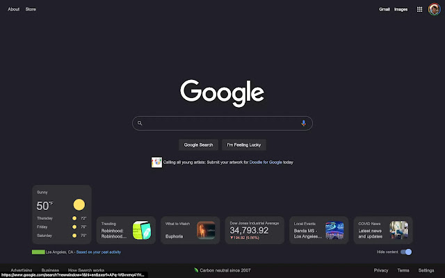
This Google homepage will always be noted for having a simple UI with a search area at the top. Google Search is now testing a set of widgets on the desktop browser for a Discover-like experience.
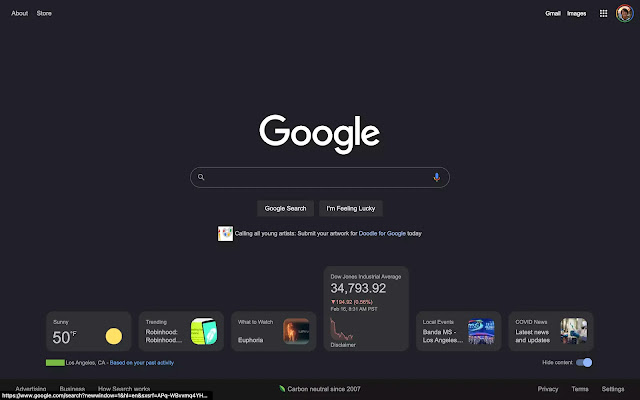
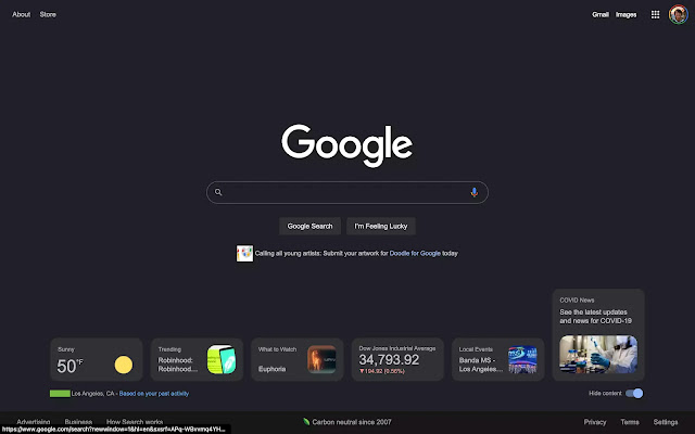
This cards may be seen at the bottom of Google.com. In the bottom-right corner, there’s a “Hide content” button, and Google notes your zip code/city and says the information is “based on your prior behaviour.” Six cards are available when the window is completely extended, and they all expand on hover.
Google Search widgets on desktop web
🔎Weather
🔎Trending
🔎What to Watch
🔎Stocks
🔎Local Events
🔎COVID News
Tapping brings up the full site result, along with the Knowledge Panel card and/or Google Search experience. The number of cards displayed is determined by the size of your screen, and there is no way to navigate between them without physically enlarging the window.
Today, we’re only seeing this on two Google Accounts, across several signed-in devices. As a result, this is most likely a test to see if a complete rollout is necessary.
This gives users a Google Discover-like experience without requiring them to wade through yet another feed. Back in 2018, the business was certain that Discover would not be going to the desktop browser – just mobile.
What Google Search is trying today is similar to widgets in that it adds functionality to a popular online destination without interfering with the clean user experience. Of course, the weather is the most helpful feature, and this is a preferable alternative to the increasingly crowded Chrome New Tab page. It also has a resemblance to the iGoogle dashboard.
The first developer preview of Android 13 is now available
Day after day, billions of people all over the world use their Android smartphones to assist them in accomplishing their goals. Android’s ability to perform effectively for each of them is due in part to a collaborative effort with you, our developer community, who share input to help us improve Android.
With the Android 13 Developer Preview 1, we’re giving you a first peek at the future version of Android. We’re continuing some essential themes in Android 13, including privacy and security, as well as developer productivity. We’ll also expand on some of the more recent changes from 12L to help you make use of the 250 million or more large-screen Android smartphones now in use.
This is only the beginning of Android 13, and we’ll have plenty more to offer as the rollout progresses. Read on for a taste of what’s new, then go over to the Android 13 developer site for more information on Pixel downloads and the release schedule. As always, getting your input early is critical to ensuring that it is included in the final version. We’re excited to hear your feedback, and we appreciate your ongoing support in making Android a platform that works for everybody!
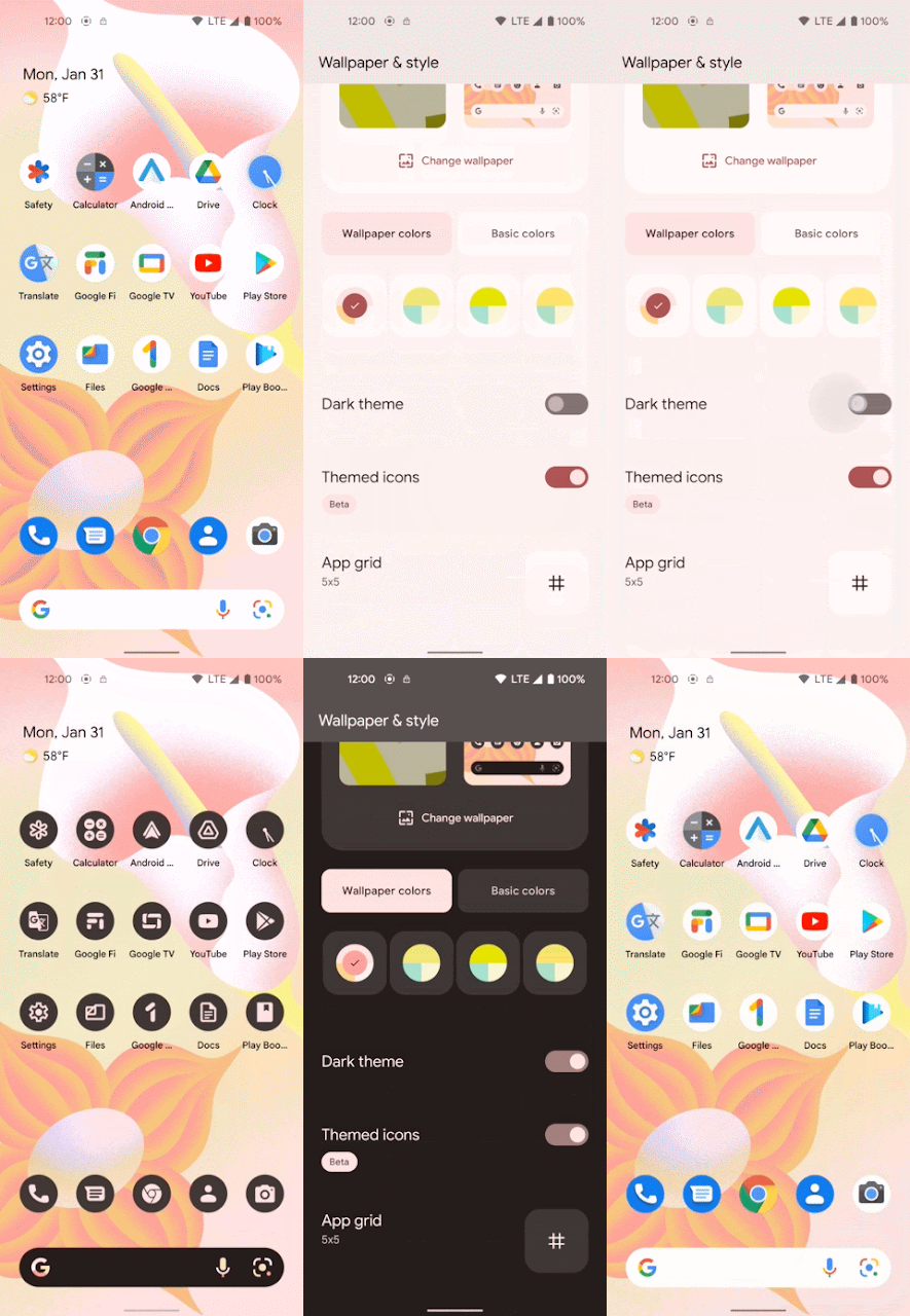
Themed application icon
In Android 13, we’re extending Material You dynamic colour beyond Google applications to all app icons, allowing users to choose between icons that inherit the hue of their wallpaper and other theme settings and icons that don’t. Only a monochrome app icon (for example, your notification drawable) and a change to the adaptable icon XML are required from your app. All developers are encouraged to supply suitable icons to allow users who have opted in to enjoy a consistent experience. Themed app icons are currently only available on Pixel smartphones, but we’re working with our device maker partners to expand their availability.
Users may choose to have customised app icons starting with Android 13. This feature tints app icons incompatible with Android launchers to match the colour scheme of the user’s wallpaper and other themes.
To use this functionality, your app must have a monochromatic app icon that is linked from the manifest’s adaptive-icon> element. If a user has activated the Themed icons toggle on their device, the system determines the tint colour by looking at the colour of the user’s wallpaper and theme, which it then adds to the monochromatic app icon.
Specifications
The following requirements should be met by your monochromatic app icon:
It must be in SVG format and not a photograph.
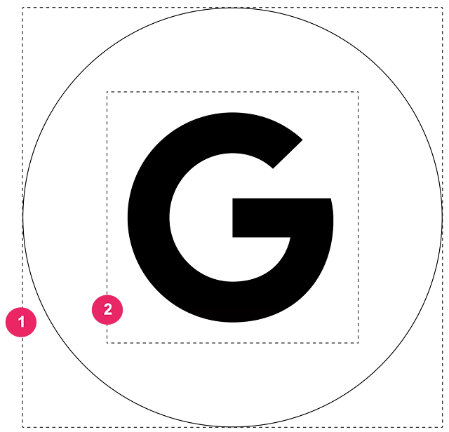
We propose that the logo be contained within a 90 × 90 dp container with a 36 x 36 dp area. If the logo must be larger, it must be at least 60 × 60 dp.
You may utilise the alpha gradient if your logo is three-dimensional.
➊Container area (90 x 90 dp).
➋ Logo area (36 x 36 dp recommended, 60 x 60 dp maximum).
At the heart of it, all are privacy and security
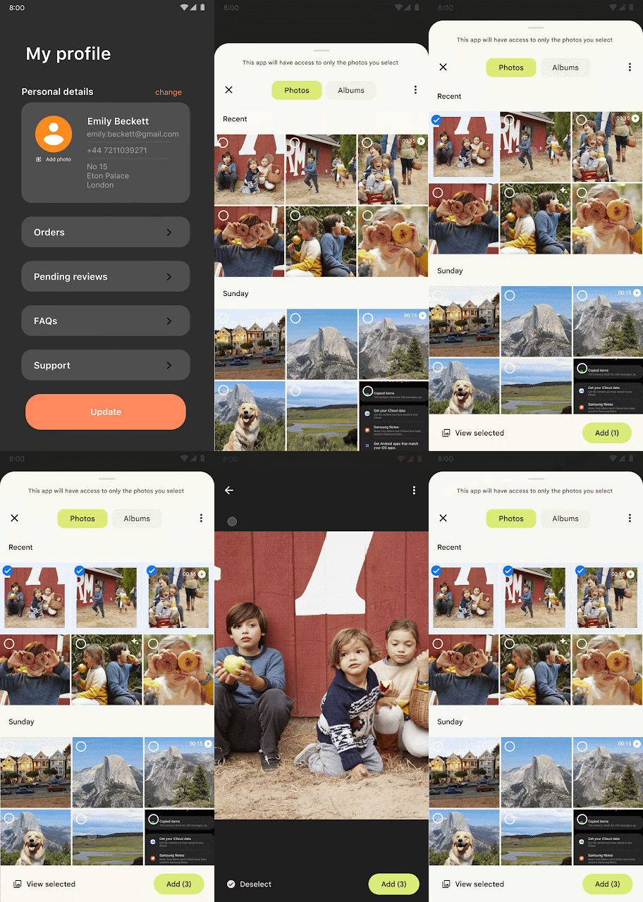
People would like an operating system and apps they can trust with their most private and sensitive data. Android 13 focuses on establishing a responsible and high-quality platform for everybody by delivering a safer environment on the device and more controls to the user, which is central to Android’s product principles. We’re adding a picture picker in today’s release to allow users to safely share photographs and videos with applications, as well as a new Wi-Fi permission to reduce the requirement for apps to have location permission. We propose that you check out the new APIs and see how they affect your project.
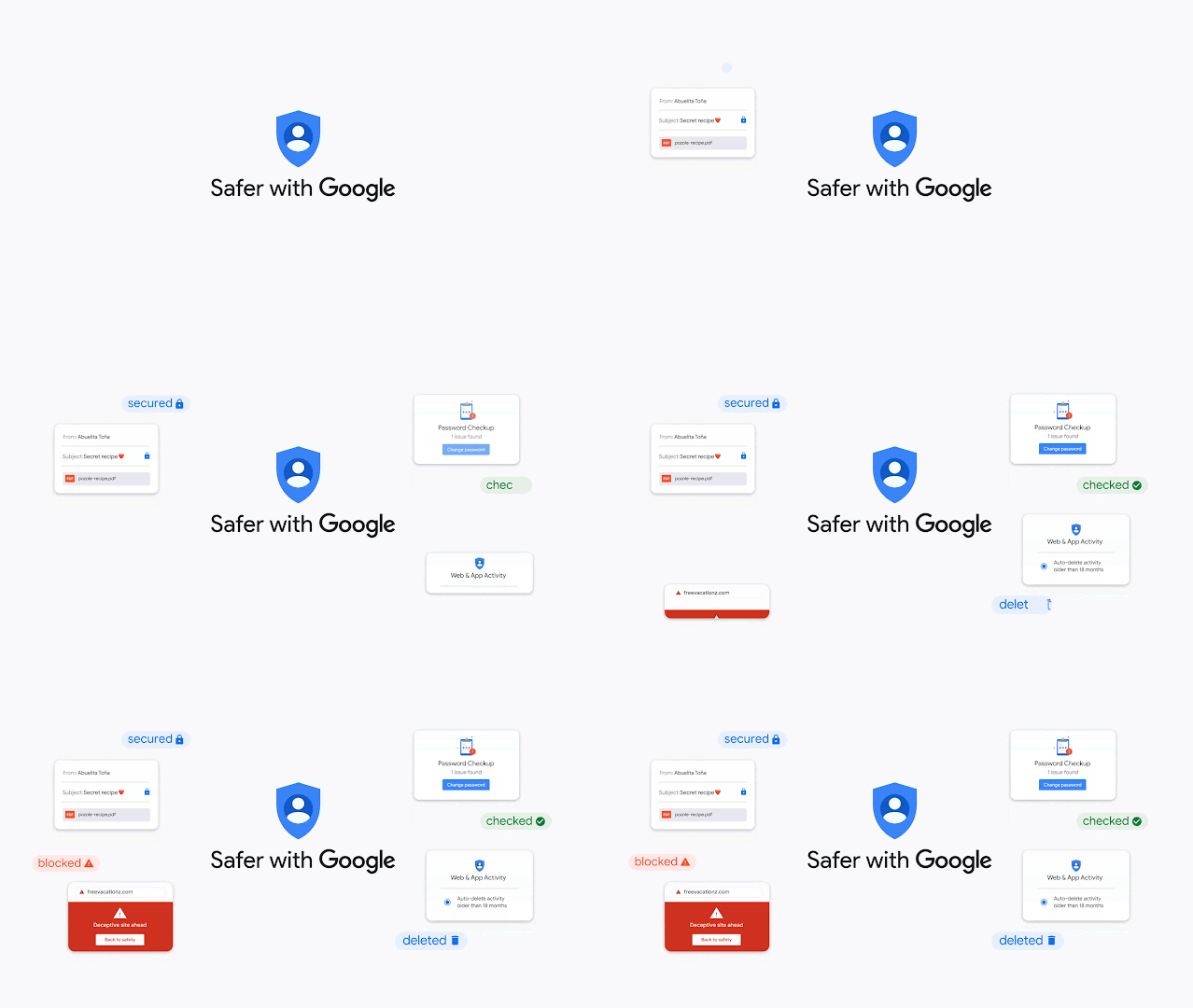
Google and other services keep you secure online
Everything we do revolves around keeping you secure online. We’re releasing updates on this effort, as well as some key new collaborations, on Safer Internet Day. We’re also unveiling new increased browsing security for everyone, as well as our toughest safeguards to date for high-risk individuals and groups.
Educating you on how to be safe when using the internet
We’ve teamed up with Khan Academy, a non-profit educational institution, to create free online tutorials to teach individuals how to be safe online. We’ll provide $5 million to Khan Academy so that it may develop accessible, understandable, and practical online safety content for its 18 million monthly users all around the world. We know people are looking for tips on how to protect themselves online because searches for “how to stop identity theft” increased by over 110% last year, and our previous work in educating people about online safety has shown us the positive impact this can have. To expand our impact, we’re excited to be partnering with Khan Academy to make internet safety more accessible to everyone.
protect your personal information
We provide simple, easy-to-use tools like Security Checkup to provide you concrete tips on how to make your Google Account more secure. Over 150 million individuals were automatically registered in two-step verification by 2021. (2SV). We’ve witnessed a 50% reduction in accounts being hacked as a consequence of our work.
We’re announcing something new today:
⁕More security for high-risk users: For high-risk users such as election workers, journalists, and human rights activists, we are the first choice. We’re stepping up our efforts to protect these high-risk users ahead of the upcoming 2022 US midterm elections. We’ve formed the Campaign Security Project in collaboration with groups from all sides of the political spectrum, giving them the resources they need to instruct candidates and campaign staff on how to be secure online. Veterans Campaign, Collective Future, Women’s Public Leadership Network, LGBTQ Victory Institute, Center for American Ideas, University of San Francisco, Emerge, Latino Victory, and others are among the organisations participating. This will complement our current efforts with Defending Digital Campaigns, the USC Election Cybersecurity Initiative, and Cybersecurity for State Leaders.
⁕Enhanced Safe Browsing at the Account Level: You’ll be able to opt into Google’s account-level improved safe surfing feature next month, which will provide you with the most comprehensive security protection against threats you experience on the web and against your Google Account. Soon, you’ll be able to enable this feature automatically during a Security Checkup or manually in your account settings.


![[Exclusive] CAD renders of the Google Pixel 7 Pro has leaked [Exclusive] CAD renders of the Google Pixel 7 Pro has leaked](https://blogger.googleusercontent.com/img/a/AVvXsEhtK8TsrJCGVJWic10NF29Tu4vi26KxwMDWGj0FSVhTbxGEhpr4FrWJig4I-ioJ19SWqprc319Hzd9GSL9VNFslo6L2LEuYfCK03FL3mdMWiW0xFpRiyBWvrfbieV2h61DcdFqFVUi8B_CDlX1jvjvx95RJTk5sQSDzoGK71h83ornm1D_zmx08YdUIlw=w640-h360)
![[Exclusive] CAD renders of the Google Pixel 7 Pro has leaked [Exclusive] CAD renders of the Google Pixel 7 Pro has leaked](https://blogger.googleusercontent.com/img/a/AVvXsEim_H-ZOTEUFJu0D_J2rD24dZ2egemR9a4VwbQgtVowT5gpmm1we6I6hsSk-wlEPW7ngoXh1-daFazo_TyR02WLLpztIDOsJucOcQzRF4epe0t786run_enlFm2TjRNXuzr5ZjWgUkRpBCqOENGjtTVSUXZPSbiCb_895BYg4FZ1NJjAYFbl2gJk94AaQ=w640-h320)
![[Exclusive] CAD renders of the Google Pixel 7 Pro has leaked [Exclusive] CAD renders of the Google Pixel 7 Pro has leaked](https://blogger.googleusercontent.com/img/a/AVvXsEjup_b5apjblqSrzkjtnL3XXp03K3lhCIfupaJfmmlx-aXXNFmW_QgMBKvaDO2vcEF6_7d-n_FkkctLs3y4mdUOPqG4pKhffcZsCnJ11Uh4x2mn3xx32S2mgAGwh760yzaIvL4AJhK3l7LRCX5vKPtrSaAkjREvc9IvwrUi66H38DqaHDWOtDrZvWQPDA=w640-h552)
![[Exclusive] CAD renders of the Google Pixel 7 Pro has leaked [Exclusive] CAD renders of the Google Pixel 7 Pro has leaked](https://blogger.googleusercontent.com/img/a/AVvXsEhL20L4ENKZsHTvGYQRTTKT8Tyu52MQQaOsVwxvf9HOYbEqlMyRmsXrh8KZeA-xOpXxqPDvpmHjSMCLVftuzk_lrXJyUsZ44PHq0NQNz_l7YYO1qOlief4g8kcrS5L6tHON13T6epfcItUrkdu4N1tW24NhvVPUQnhy9ppZlj2-8vGLWmVN70lTynAJhA=w640-h510)
![[Exclusive] CAD renders of the Google Pixel 7 Pro has leaked [Exclusive] CAD renders of the Google Pixel 7 Pro has leaked](https://blogger.googleusercontent.com/img/a/AVvXsEib4g2dDSbHBz6GyGzy4tYFZWVXEYf7OwVpgn6FEqQTVgrv3qNu8X_e5o3h-1pubnDVyvlnVLoHz7-VbtASkDpdSq9kpL-AA1nTsHashx7VmTRX6xIiO-1AOTS8UB5HHru6nWtPBsfohxbNAZGPH0MxeYFc6FxvZ89mtxowsgGLE_FE4w2DqCHEfMAv4Q=w640-h504)
![[Exclusive] CAD renders of the Google Pixel 7 Pro has leaked [Exclusive] CAD renders of the Google Pixel 7 Pro has leaked](https://blogger.googleusercontent.com/img/a/AVvXsEi6DsfRDEmkP5hS3_y_B0avggQRbidBrYJogaHNRmYxLftBbzLkB_sQejL5Dk5LQMxTWrs9_6LzlFo5GxBywojbMFo5EGmh1O8_gd6oAxmGaVDs_v-PBxFVzQz1gpBIta4LO2sMQmNBgRQVbbOmqCFpBZcI8kdUqvREMjqtOhwyO8P3r81o8Cimjvg7Tg=w640-h360)
![[Exclusive] CAD renders of the Google Pixel 7 Pro has leaked [Exclusive] CAD renders of the Google Pixel 7 Pro has leaked](https://blogger.googleusercontent.com/img/a/AVvXsEifXW6A2ZIyA2GfY1M9LDXmKcj07b75SUGJ9QQO8vFwVDvYurSjeqbCPubFwKUbgeDLkLV_cAxTNIB1bjz6-uzRytcCM4CYtfm9NoKudkjZwUz4tikbMpIWiHjczUeoKlxKk3902GAJDVUhlnPdvbmqVy9MMA_YuH0lTj39gNChZbE6E7ceeqATJmj09g=w640-h360)
