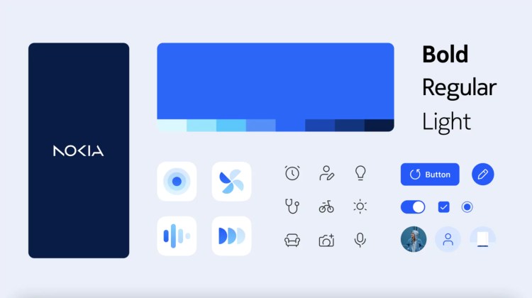
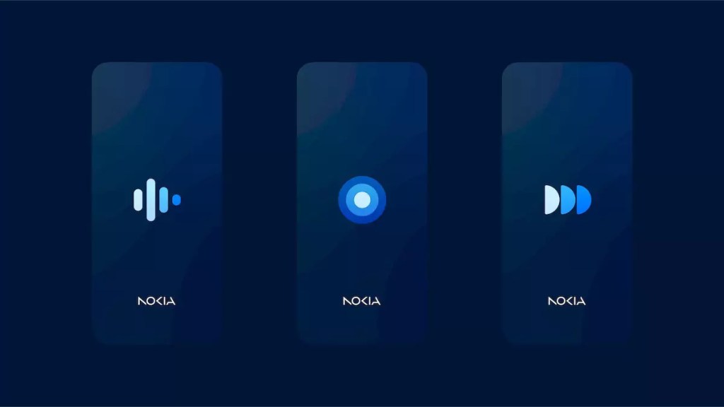
In February, Nokia made news at MWC 2023 when it debuted a new Nokia logo, which the firm claims are following a new approach and strategy for branding and promoting its goods and services. In light of this, the company has now announced “Nokia Pure,” a design system that gives the digital goods of the Finnish brand fresh visual concepts.
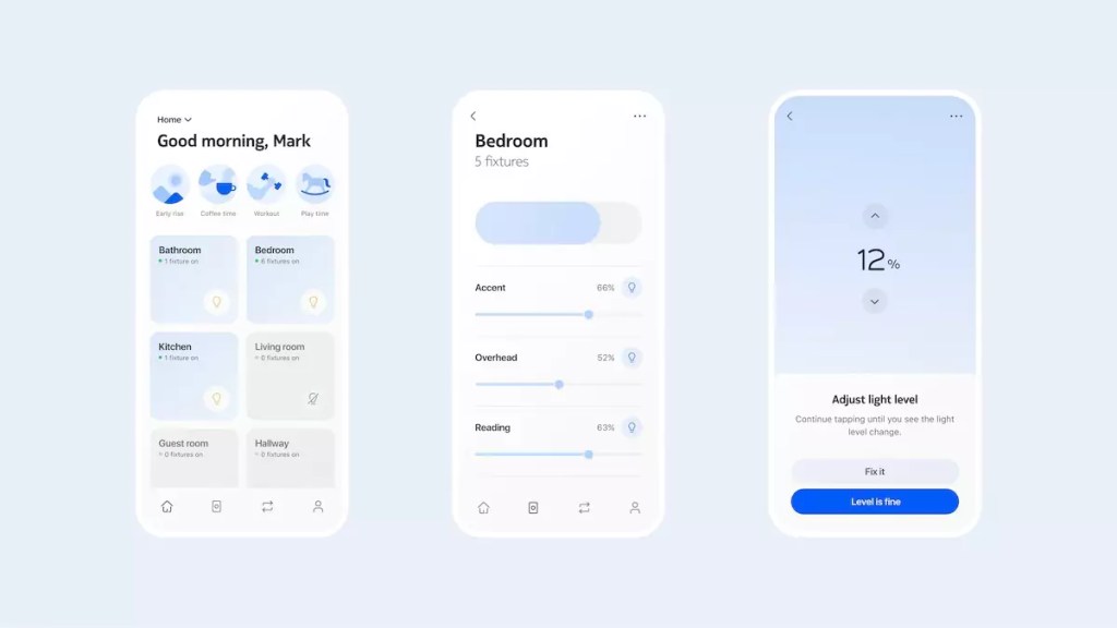
Nokia claims that the new design system was created to develop digital products that would be future-proof, employing a variety of elements and rules that are focused on providing consumers with a new, simple, and “fresh” appearance, in keeping with the logo reveal from a month ago.
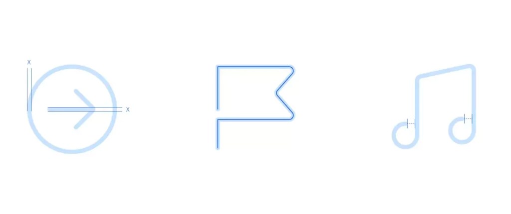
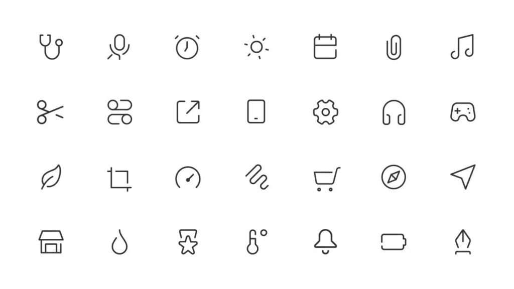
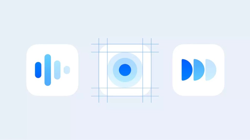
When creating the new UI, Nokia provided some information. One example is the significant jump in software icons, particularly considering that Nokia devices often maintain the “stock” design of Android. Yet the Pure UI has been carefully designed, with a focus on flexible strokes that can adjust to various device platform sizes.
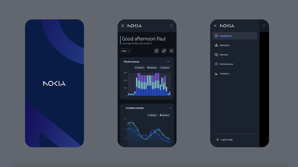
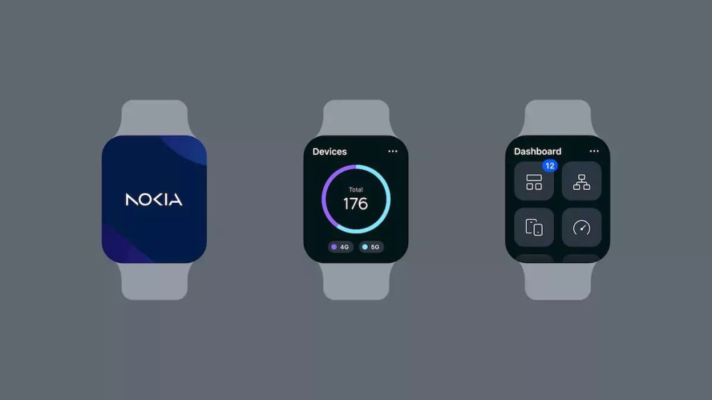
The onboard graphics, information, and panels that provide visualized data streams and graphics all conform to the same graphic style. According to Nokia, the attachment on simple also combines logical concepts, all while allowing for adaptation for user-friendliness and comprehension.
In light of recent modifications to other user interfaces, such as One UI and Color OS, which have seen significant development, this latest Nokia software release is a wonderful improvement. Although there is no information on when or where we may see this new UI in use, it appears that it will, at least initially, be limited to future software items and apps.


